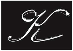
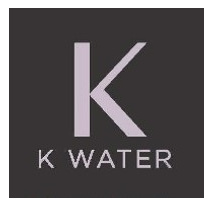
The EU General Court recently decided there was no likelihood of confusion between the below "K" stylised marks. In reaching its conclusion, the Court stressed that a finding of a likelihood of confusion between the two signs which consist of the same, single letter – but with one highly stylised and the other stylised in a different way with additional elements – would have, de facto, amounted to granting a monopoly over one letter of the alphabet for a specific range of goods and services.
Single letter marks are often expressed in a stylised form. The decision suggests that protection for certain single letter marks may be limited given that, the shorter a sign, the relevant public may more likely notice graphic and stylistic differences with other signs.
Background
In 2019 L’Oréal sought to register an EU trade mark for a figurative sign (K K WATER) in class 3, for “hair preparations and treatments; hair care preparations not for medical purposes; preparations for setting hair”. An opposition was filed on the grounds of likelihood of confusion based on the earlier figurative EU trade mark "K" which was registered in class 3 (including for shampoo and 'lotions for cosmetic purposes'), as well as classes 29, 30 and 31.


The earlier figurative mark L’Oréal's applied for mark
Overturning the Opposition Division's rejection of the opposition, the Board of Appeal had concluded that a significant part of the relevant public would be led to believe that identical goods bearing what it considered to be similar marks would have come from the same undertaking, or ones that were economically linked.
General Court Decision
The General Court upheld L'Oréal's appeal, however, and rejected the opposition declaring there was no likelihood of confusion, following its assessment of the visual, aural and conceptual similarity of the marks. The General Court held that the Board of Appeal had failed to take into account the “overall impression given by the marks, bearing in mind, in particular, their distinctive and dominant elements”. In particular, the Board had wrongly disregarded the importance of the “K WATER” word elements in L'Oréal's mark when conducting its visual and conceptual comparison. Whilst the General Court agreed that the large "K" was the dominant element of L'Oréal's mark, the "K WATER" element occupied a "significant and notable part of the sign" due to its font, size and positioning. Although those word elements could be described as secondary, "their importance cannot be reduced to the point of actually rendering them negligible".
Visually, the General Court went on to conclude that the similarity between the two marks was low. The Board of Appeal had failed to take a view of the mark as a whole – it held that the graphic differences between the marks played a minor role and the public, above all else, would focus on the identical single letter "K". However, the General Court considered that, whilst the dominant element of the mark was the letter "K", the calligraphic writing used for the earlier mark gave it additional "dynamism" differentiating it from the application. Further, the difference in colour of the lettering in the respective marks (pink vs white), whilst subtle, was an element that individualised the marks and could not be disregarded.
The Court concluded that, whilst the marks resembled each other in that they both included a large "K", they were distinguishable by their different stylisation, colours, and the presence of the “K WATER” word element. The black box used in both marks was considered purely decorative.
The General Court also considered that the Board had underestimated the phonetic impact of the "K WATER" element, concluding instead that the pronunciation of the marks varied greatly in sound and length – four syllables as opposed to one.
As for the conceptual comparison, the Board had been correct to conclude that the letter "K" had no meaning to the goods in class 3. However, the Board had again wrongly ignored the presence of the “K WATER” element which meant L'Oréal's mark would be associated with water. The General Court therefore concluded that the marks were conceptually different.
Whilst the goods were identical, and the earlier sign was found to have a normal amount of inherent distinctive character (given its high degree of stylisation), the signs showed only a low degree of similarity at a visual and phonetic level and were conceptually different. Given the importance of the visual comparison (due to how hair care products are marketed and sold, the average customer having the opportunity to pick up, inspect and compare the products), the significant visual differences between the two marks meant there was no likelihood of confusion. Consumers would not believe that the goods in question came from the same or economically linked undertakings.